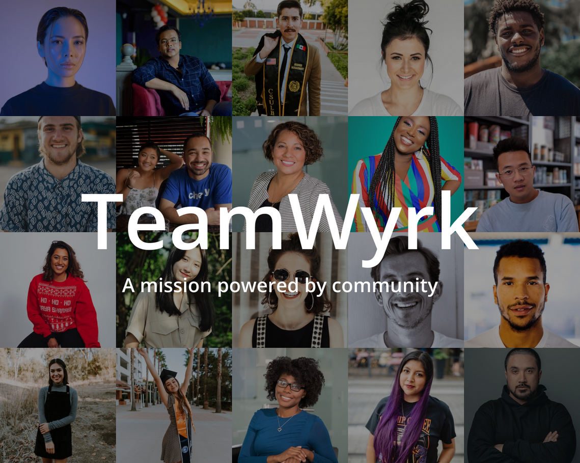
What is Teamwyrk, and what was my role?
Teamwyrk is a career advancement platform created to help entry-level jobseekers land their next role in tech. With the help of established tech professionals, jobseekers receive assistance in honing skills necessary to showcase themselves as strong candidates.
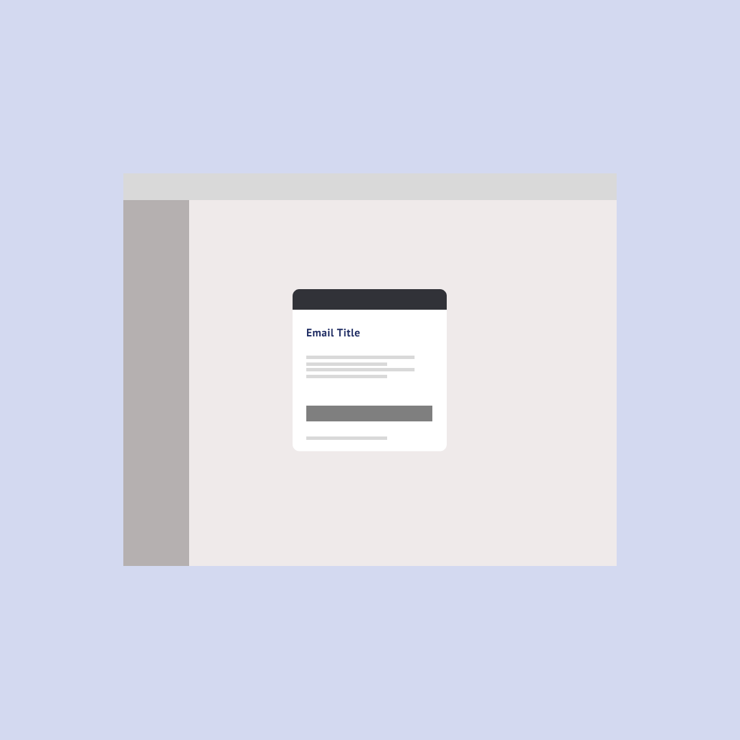
As one of two designers at the startup, I lead design for the user navigation, notifications, and emails.
As this was an MVP build, only basic features were completed during the 8-week sprint. My main goal was to ensure ease of navigation to reduce user confusion by basing design decisions on Jakob and Hick’s Law. My secondary goals were to establish a fundamental roadmap for future designers to build upon.
Timeline
8 weeks
Team
Al (Product Manager)
Arron, Sandy (Product Design)
Marilia, James, Yujin (Software Development)
Feature requirements
Clarity and Conciseness: Using simple language and visuals to convey core messages without ambiguity.
Relevance and Personalization: Delivering timely, valuable information tailored to each user's preferences and context.
Seamless Integration: Maintaining consistent design, tone, and branding across all touchpoints.
User Control: Providing customization options for frequency, timing, and types of communications.
Accessibility and Responsiveness: Optimizing for various devices and platforms, adhering to accessibility standards.
Technical Performance: Collaborating with developers to ensure efficient implementation and reliable deliverability.
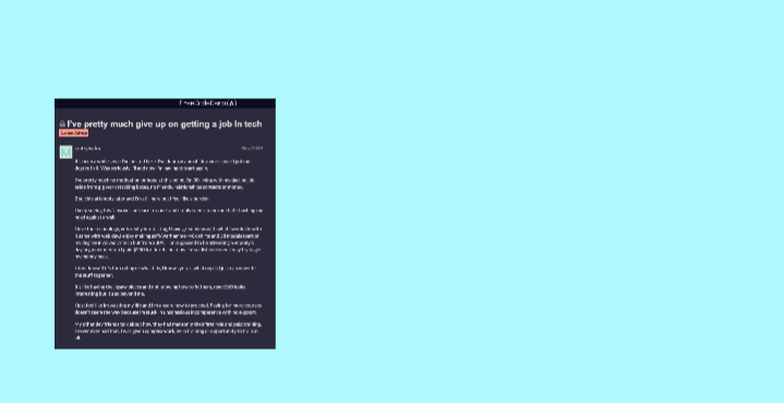
Discovering our audience
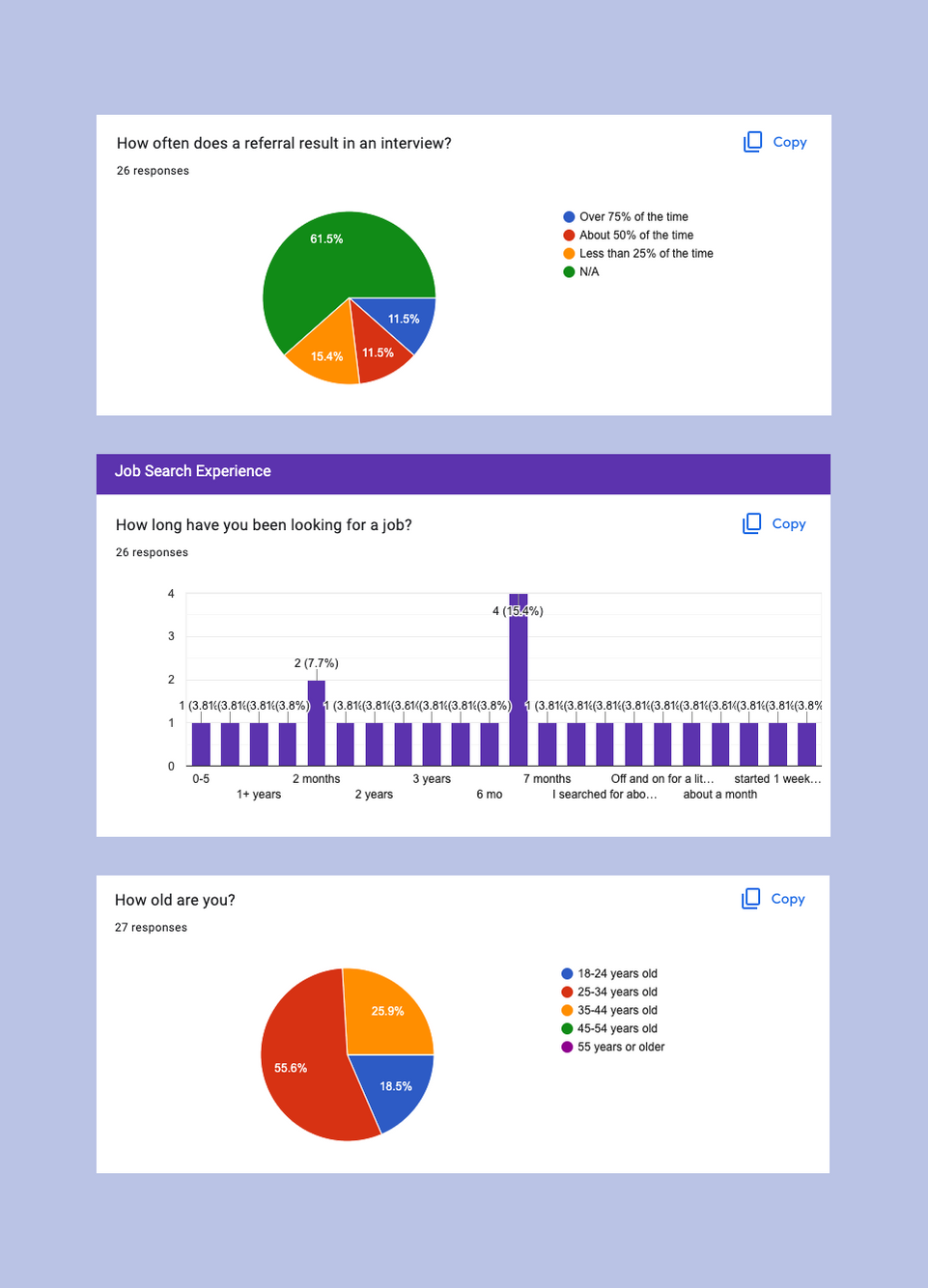
Week 1 & 2 began with me surveying 26 jobseekers aged 18-45. My research included competitive analysis to better understand the UX of other career advancement platforms (like Exponent and ADPList), and how users respond to their services. These methods provided helpful insights on our audience.
Doing a competitive analysis revealed a unique position in the US career advancement market — most are for profit platforms leveraging free resources with the goal of upselling users. A nonprofit platform will create a new ecosystem for Teamwyrk to become a sound alternative.
My findings
- 75% of respondents were trying to break into design.
- 42% of respondents have been searching 6+ months for a new role.
- User's key frustration was being ghosted by recruiters.
- The average user didn't have a set career roadmap to follow.

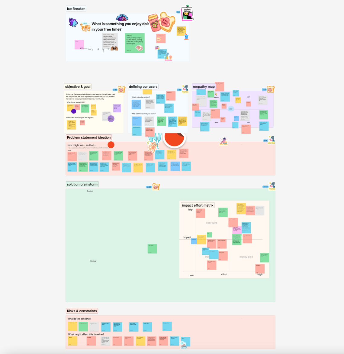
Organizing a strategy
Capitalizing on the insights from user research, week 3 began with me running a design workshop with PM, design, and engineering. The goal was to take account of user's immediate needs, pain points, and priorities and create valid solutions. Our main takeaways included:
- Policies that uphold our commitment to an empowering, accountable ecosystem.
- A secure platform for both jobseekers and volunteers.
- New to market initiatives that will turn users into advocates to build social proof.
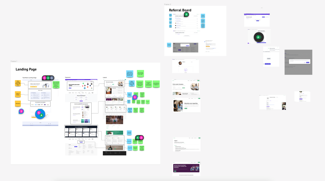
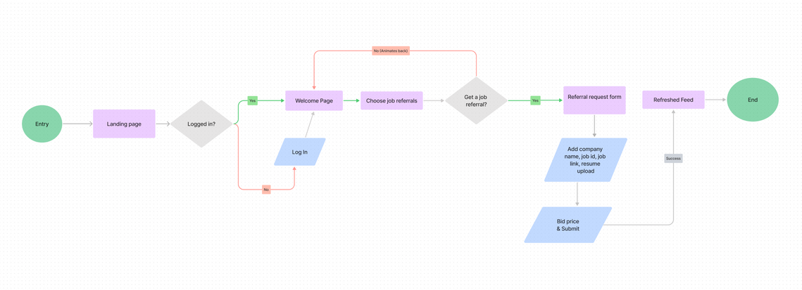
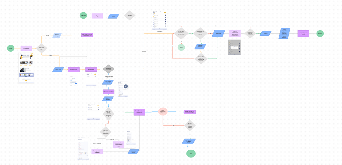
Initial user flow
I started a basic user flow in week 4 to ensure the process was smooth and to account for all the areas where emails and notifications would need to be. Week 5 was spent prepping for low fidelity wireframes.
Designs & Process
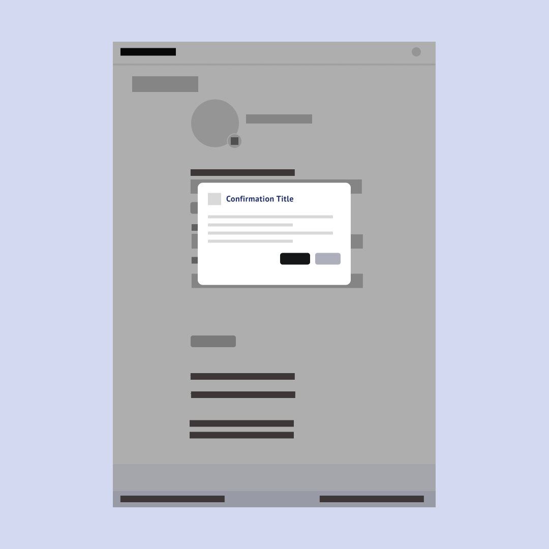
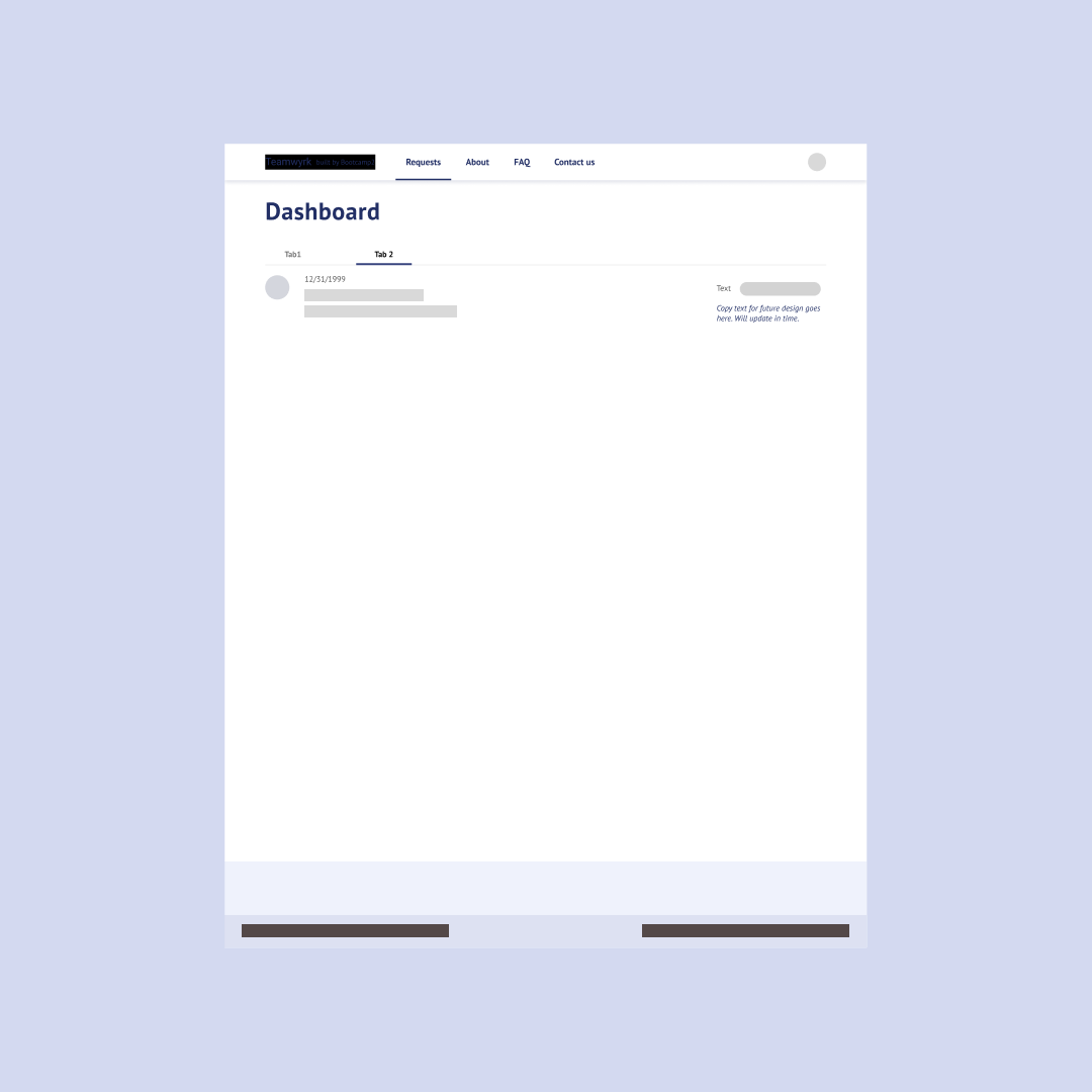
Due to time constraints, going straight from low to high wireframes allowed me to quickly visualize and validate the final design direction.
Below are design decisions balancing the needs of the user and maintaining the north star of simple and effective navigation cues.
Testing our process
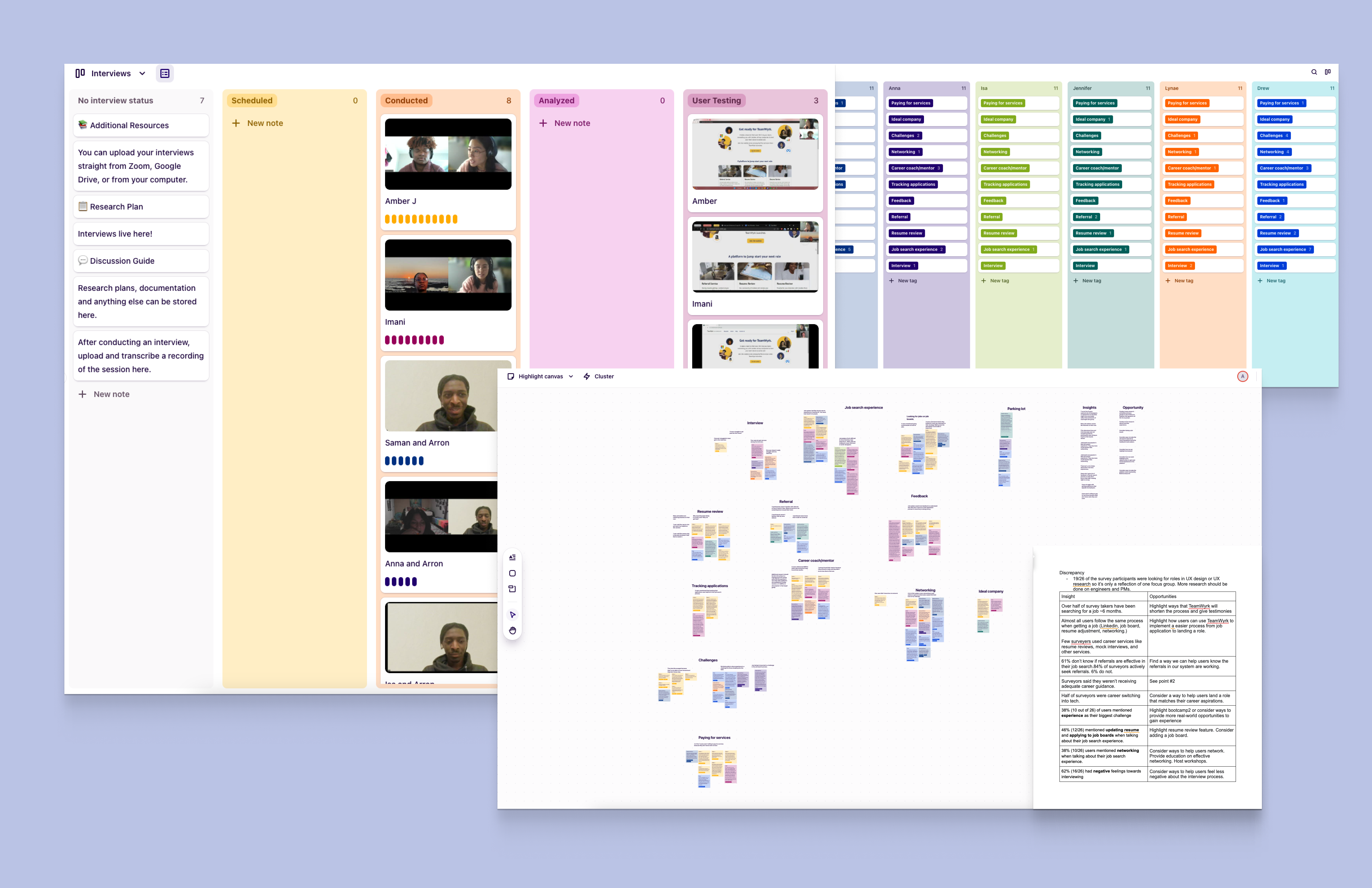
As we entered week 7, I conducted usability testing with some respondents from our survey.
Together with Sandy, I conducted 9 30-minute moderated usability test sessions, with 18 in total between us. Our goal was to test user navigation and understanding of key terms used on the platform.
This produced valuable feedback for iterating and honing the UX right up to our launch deadline. However, everything wasn't smooth sailing.
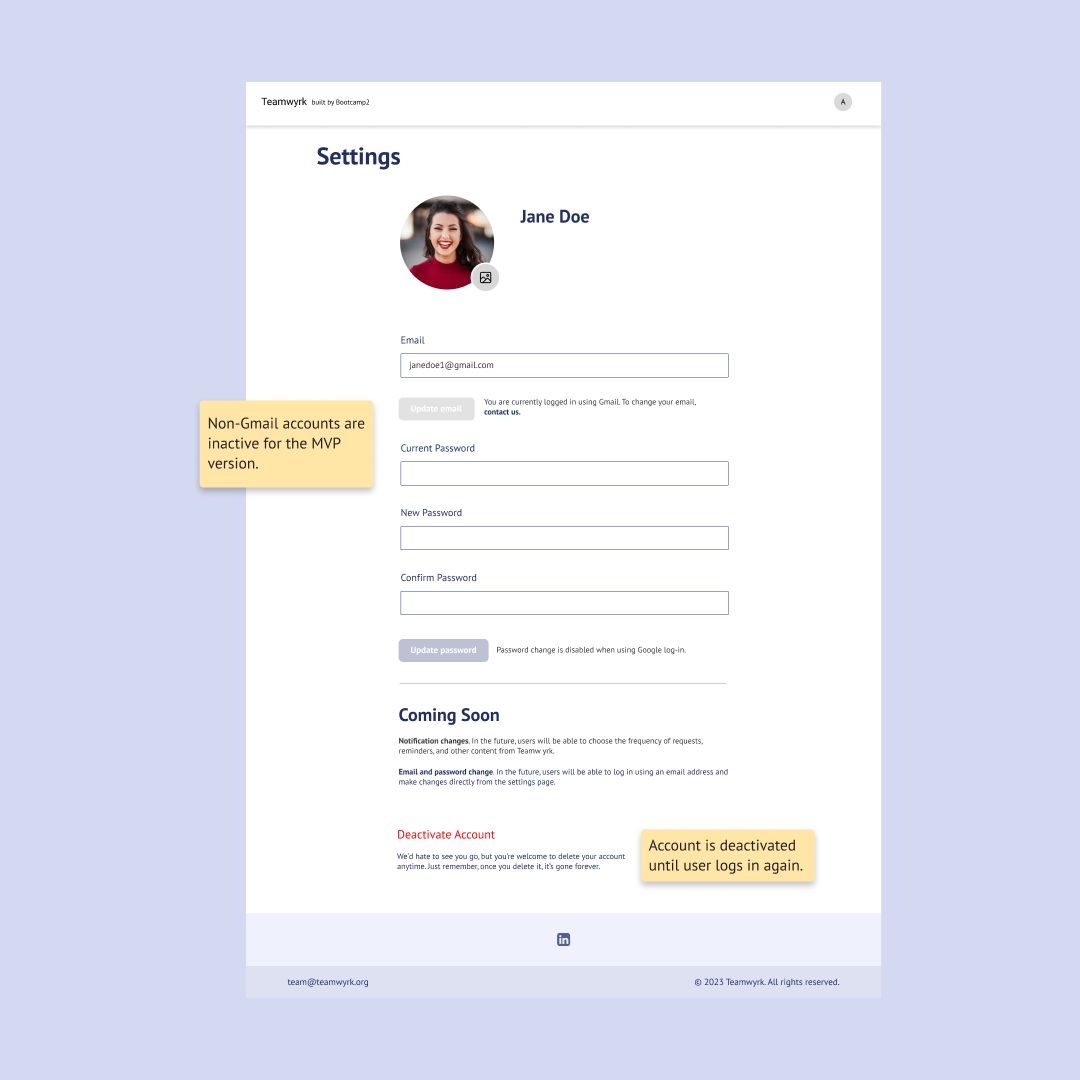
The two key issues were identified, one not understanding what an "Insider" was and navigating the referral request flow. This hindered some users from getting to the steps where they received notifications.
To resolve this, I revised come copy on the dashboard and request form to ensure a smooth process for users to follow.
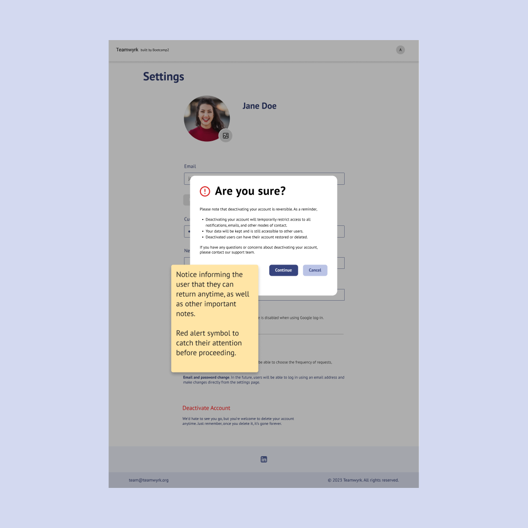
Improvements on design
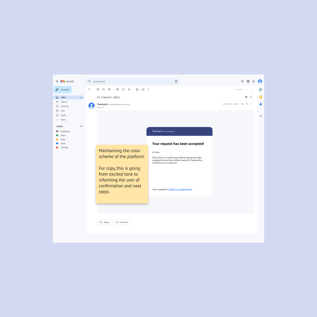
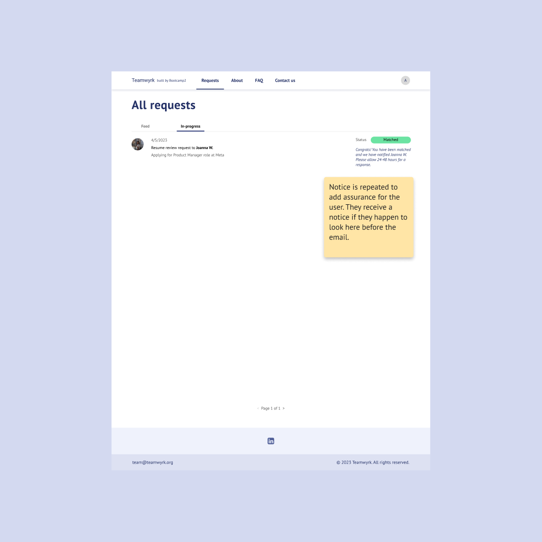
The usability testing provided key insights on necessary improvements. One example is learning users wanted clear visibility into how their data would be used. This led to prominent placement on the privacy policy page, as well as contextual assurance across the platform.
The revised copy helped users to better understand how to navigate through the platform at first use. Microinteractions like loading file states and progress pills in the dashboard solidified user confidence through each step.
Through ongoing user feedback, we refined the UI to meet the right mix of clarity, utility, and cohesiveness.
Improving the design system
I collaborated with Sandy to construct a design system, maintaining content consistency for designers and engineering. We also collaborated on enhancing the existing user flow, allowing future implementation for notifications.

Launching the MVP
To meet our week 8 launch deadline, the design, and engineering teams came together for final QA testing on the website's pages.
With engineers in different time zones, I left detailed Figma annotations to confirm requirements and specs. Once all criteria were met and no blockers were found, we launched the live website on time.
Impact Made
18 users tested
77% navigation score
88% navigation score